Code
import ocha_stratus as stratus
import pandas as pd
import numpy as np
import matplotlib.pyplot as plt
import matplotlib.patches as mpatches
from tqdm.auto import tqdmIn this document we take the full weight grid created in the previous chapter and do additional analyses to select one set of weights to use for monitoring.
Prior to writing this chapter, the stakeholder group decided to only consider April as an activation moment. This simplifies the final selection.
import ocha_stratus as stratus
import pandas as pd
import numpy as np
import matplotlib.pyplot as plt
import matplotlib.patches as mpatches
from tqdm.auto import tqdm# load the dataset containing all the weight sets and their performance metrics.
blob_name = "ds-aa-afg-drought/weight_parameter_set/gte1984/historical_weighted_w_mixed_fcast_obsv.parquet"
df_weights = stratus.load_parquet_from_blob(blob_name)Here we look at a histogram of End of Season (EOS) ASI values to understand the distribution of our target variable.
df_weights["zscore_asi_Jun"].hist()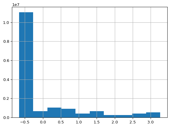
Since we’re only concerned with April as the activation moment, we filter the dataset to only include April data:
df_weights_apr = df_weights[df_weights["pub_mo_label"] == "Apr"]We need to transform the hierarchical weight data structure into a flat format that’s easier to analyze. The following process:
This next cell is extracting the unique weight sets for April, pivoting them wider, and calculating the standard deviation of each weight set group:
dicts = []
# Loop through each unique weight ID and its corresponding group of data
for wt_id, group in df_weights_apr.groupby("wt_id"):
    # Extract the weight set configuration from the first row of this group
    wt_set = group.iloc[0]["wt_set"]
    # Start building a dictionary with the weight ID
    dict_in = {"wt_id": wt_id}
    # Loop through each parameter-weight pair in the weight set
    for wt_set_param in wt_set:
        parameter = wt_set_param[
            "parameter"
        ]  # The name of the parameter/indicator
        weight = wt_set_param[
            "weight"
        ]  # The weight value assigned to this parameter
        # Add this parameter and its weight to the dictionary
        dict_in.update({parameter: weight})
    # Add the completed dictionary to our list
    dicts.append(dict_in)

# Convert the list of dictionaries to a DataFrame
df_wt_set = pd.DataFrame(dicts)
# Calculate the standard deviation of weights across parameters for each weight set
# (excluding the wt_id column since it's not a weight)
df_wt_set["std"] = df_wt_set.drop(columns="wt_id").std(axis=1)Here we remove weight sets that have any parameters with zero weight, since we want all parameters to contribute to our model:
df_wt_set_nonzero = df_wt_set[df_wt_set.drop(columns="wt_id").min(axis=1) > 0]df_weights_apr_nonzero = df_weights_apr[
df_weights_apr["wt_id"].isin(df_wt_set_nonzero["wt_id"].to_list())
]num_unique_weights_processed = df_weights_apr_nonzero["wt_id"].nunique()we are then left with 8907 different weights.
For each remaining weight set, we calculate performance metrics across all provinces:
dicts = []
p, pp, n, pn = 14, 14, 14, 14
for wt_id, wt_group in tqdm(df_weights_apr_nonzero.groupby("wt_id")):
    for adm1_name, adm1_group in wt_group.groupby("adm1_name"):
        corr = (
            adm1_group[["zscore", "zscore_asi_Jun"]]
            .corr()
            .loc["zscore", "zscore_asi_Jun"]
        )
        tp = (
            adm1_group[["zscore_flag", "zscore_asi_Jun_flag"]]
            .all(axis=1)
            .sum()
        )
        fp = pp - tp
        fn = p - tp
        f1 = 2 * tp / (2 * tp + fp + fn)

        dicts.append(
            {"wt_id": wt_id, "adm1_name": adm1_name, "corr": corr, "f1": f1}
)df_metrics = pd.DataFrame(dicts)Below is an example from the resulting data.frame of one weight set.
df_metrics.set_index("wt_id").loc[10649]| adm1_name | corr | f1 | |
|---|---|---|---|
| wt_id | |||
| 10649 | Faryab | 0.819064 | 0.857143 |
| 10649 | Sar-e-Pul | 0.620994 | 0.642857 |
| 10649 | Takhar | 0.728837 | 0.714286 |
We visualize the distribution of F1 scores and correlations across all weight sets to understand the overall performance landscape:
df_metrics.groupby("wt_id").mean(numeric_only=True).hist()array([[<Axes: title={'center': 'corr'}>, <Axes: title={'center': 'f1'}>]],
dtype=object)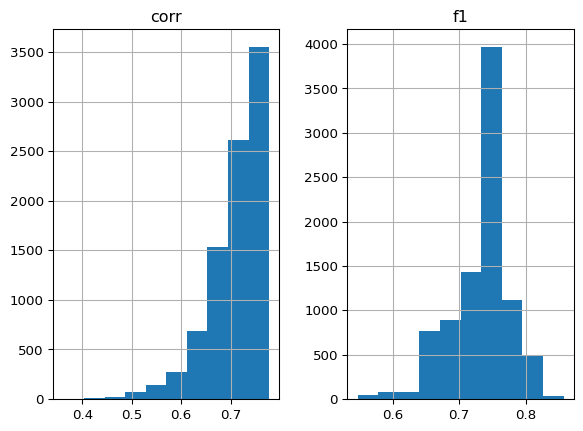
df_metrics = df_metrics.merge(df_wt_set[["wt_id", "std"]])We calculate the mean performance metrics for each weight set across all provinces:
df_metrics_mean = (
    df_metrics.groupby("wt_id").mean(numeric_only=True).reset_index()
)fig, ax = plt.subplots(dpi=200, figsize=(6, 6))
df_metrics_mean.plot(
x="f1",
y="std",
linewidth=0,
marker=".",
color="k",
ax=ax,
legend=False,
alpha=0.2,
markersize=10,
markeredgewidth=0,
)
ax.set_xlabel(r"$F_1$ score (average over provinces)")
ax.set_ylabel("Standard deviation of weights")
ax.set_title("All weight sets")
ax.spines["top"].set_visible(False)
ax.spines["right"].set_visible(False)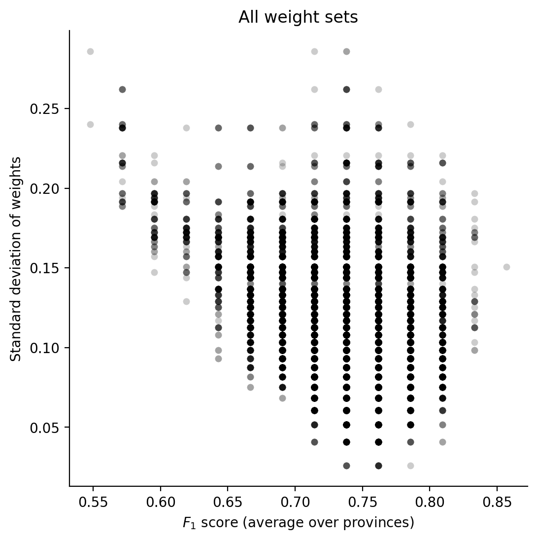
df_plot = df_metrics_mean[
    df_metrics_mean["std"] == df_metrics_mean["std"].min()
]

fig, ax = plt.subplots(dpi=200, figsize=(6, 6))
df_plot.plot(
    x="f1",
    y="corr",
    linewidth=0,
    marker=".",
    color="k",
    ax=ax,
    legend=False,
    alpha=0.2,
    markersize=10,
    markeredgewidth=0,
)

ax.set_xlabel(r"$F_1$ score (average over provinces)")
ax.set_ylabel("Correlation")

ax.set_title("Simplest weight sets")

ax.spines["top"].set_visible(False)
ax.spines["right"].set_visible(False)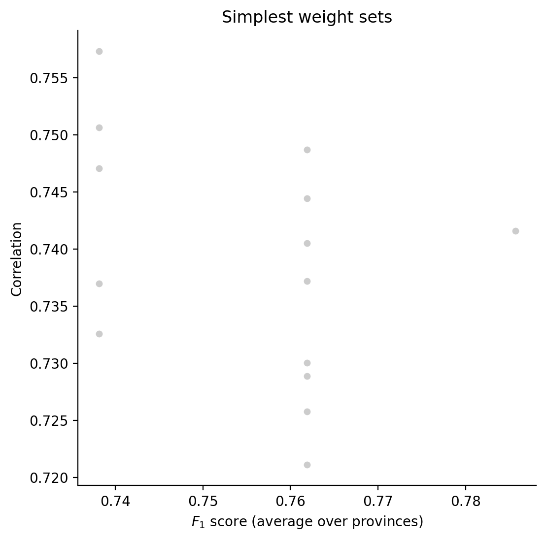
Now we identify the top 1% of weight sets based on F1 score and examine their weight distribution:
q = 0.99
mean_f1_q = df_metrics_mean["f1"].quantile(q)
df_plot = df_metrics_mean[df_metrics_mean["f1"] >= mean_f1_q - 0.00001]

fig, ax = plt.subplots(dpi=200, figsize=(6, 6))
df_plot.plot(
    x="f1",
    y="std",
    linewidth=0,
    marker=".",
    color="k",
    ax=ax,
    legend=False,
    alpha=0.2,
    markersize=10,
    markeredgewidth=0,
)

ax.set_xlabel(r"$F_1$ score (average over provinces)")
ax.set_ylabel("Standard deviation of weights")

ax.set_title(
    f"Top {len(df_plot)} weight sets\n"
    f"({q*100}th percentile based on "
    r"$F{_1}$ score)"
)

ax.spines["top"].set_visible(False)
ax.spines["right"].set_visible(False)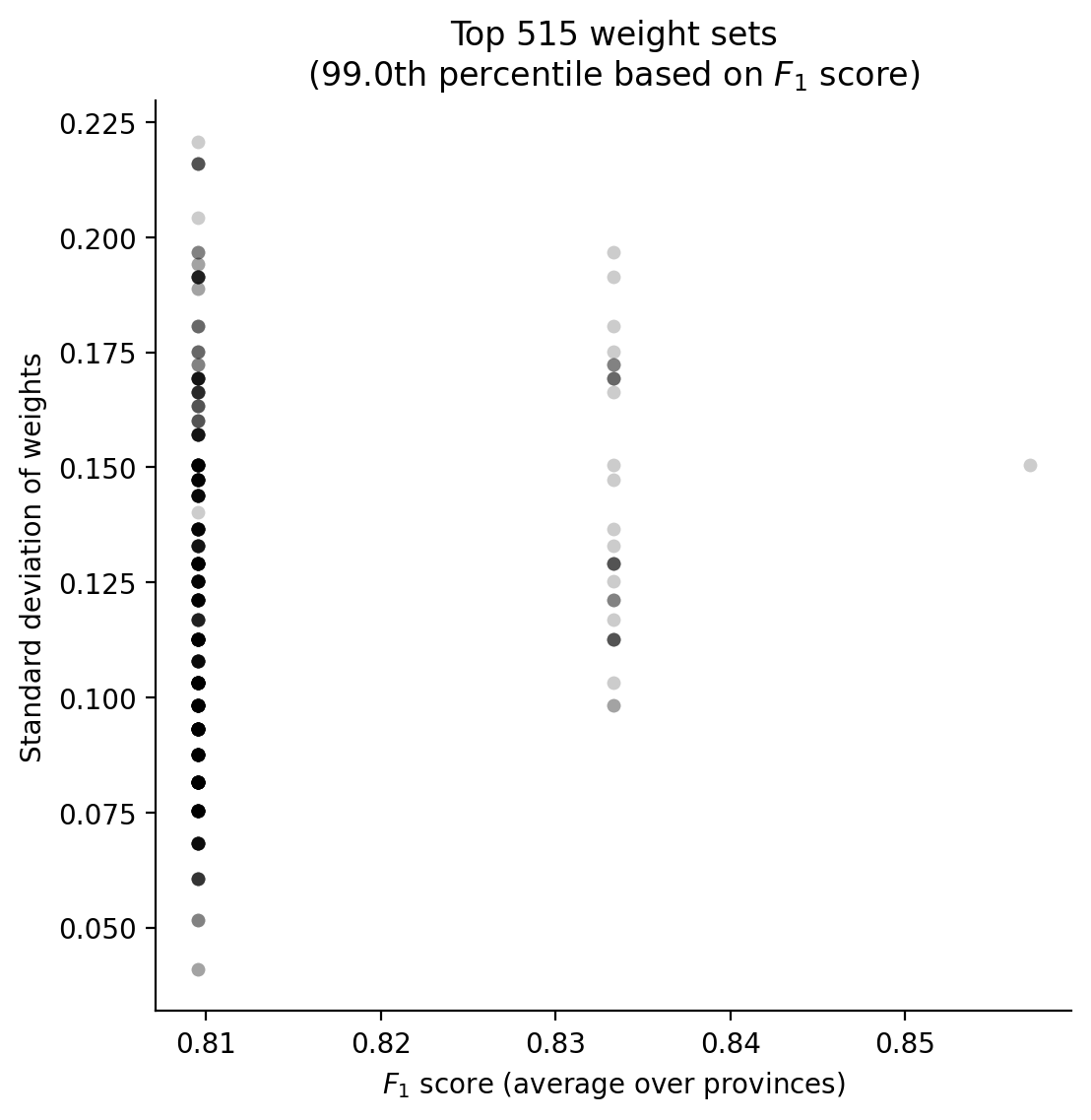
q = 0.99
mean_f1_q = df_metrics_mean["f1"].quantile(q)
df_plot = df_metrics_mean[df_metrics_mean["f1"] >= mean_f1_q - 0.00001]

fig, ax = plt.subplots(dpi=200, figsize=(6, 6))
df_plot.plot(
    x="f1",
    y="std",
    linewidth=0,
    ax=ax,
    legend=False,
)

for wt_id, row in df_plot.set_index("wt_id").iterrows():
    ax.annotate(wt_id, (row["f1"], row["std"]), fontsize=6)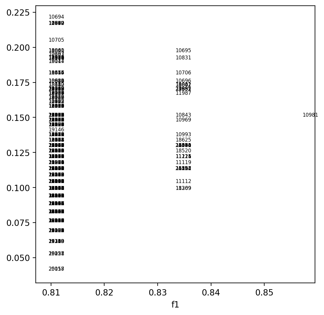
# We define colors and labels for each parameter to ensure consistent visualization:

color_dict = {
    "era5_land_soil_moisture_1m": "#1E90FF",
    "cumu_era5_land_total_precipitation_sum": "#80CFFF",
    "vhi": "#CAB2D6",
    "mam_mixed_seas_observed": "#00FFFF",
    "era5_land_snow_cover": "#FFFFFF",
    "asi": "#008B00",
}

label_dict = {
    "era5_land_soil_moisture_1m": "Soil Moisture (1m, ERA5)",
    "cumu_era5_land_total_precipitation_sum": "Cumulative Precipitation (ERA5)",
    "vhi": "VHI",
    "mam_mixed_seas_observed": "Mixed Forecast/Observ. (SEAS5/ERA5)",
    "era5_land_snow_cover": "Snow Cover (ERA5)",
    "asi": "ASI",
}This advanced visualization shows the top 0.1% of weight sets based on F1 score, with small stacked bars indicating their parameter compositions:
q = 0.999
mean_f1_q = df_metrics_mean["f1"].quantile(q)
df_plot = df_metrics_mean[df_metrics_mean["f1"] >= mean_f1_q - 0.00001]

xvar = "corr"
yvar = "std"

fig, ax = plt.subplots(dpi=200, figsize=(8, 8))
df_plot.plot(x=xvar, y=yvar, linewidth=0, ax=ax, legend=False)

# Calculate data range
x_min, x_max = df_plot[xvar].min(), df_plot[xvar].max()
y_min, y_max = df_plot[yvar].min(), df_plot[yvar].max()

# Compute buffer (10% of the range)
x_buffer = 0.1 * (x_max - x_min)
y_buffer = 0.1 * (y_max - y_min)

# Define new bounds
xmin, xmax = x_min - x_buffer, x_max + x_buffer
ymin, ymax = y_min - y_buffer, y_max + y_buffer

ax.set_xlim(xmin, xmax)
ax.set_ylim(ymin, ymax)

bar_total_height = 0.005
bar_width = bar_total_height * x_buffer / y_buffer

for wt_id, row in df_plot.set_index("wt_id").iterrows():
    wt_row = df_wt_set.drop(columns="std").set_index("wt_id").loc[wt_id]
    # Extract only the variables that exist in color_dict
    values = wt_row[list(color_dict.keys())] * bar_total_height
    colors = [color_dict[key] for key in values.index]

    # Compute bottom positions for stacking
    bottoms = np.insert(np.cumsum(values[:-1]), 0, 0)

    # Plot a small stacked bar at the (corr, std) location
    for value, bottom, color in zip(values, bottoms, colors):
        ax.bar(
            bottom=bottom - bar_total_height * 0.5 + row[yvar],
            x=row[xvar],
            width=bar_width,
            height=value,
            color=color,
        )

ax.set_xlabel("Correlation (average over provinces)")
ax.set_ylabel("Standard deviation of weights")

legend_handles = [
    mpatches.Patch(color=color, label=label_dict[key])
    for key, color in color_dict.items()
]
ax.legend(
    handles=legend_handles,
    title="Weights",
    loc="upper left",
    fontsize=8,
)

ax.set_title(
    f"Top {len(df_plot)} weight sets\n"
    f"({q*100}th percentile based on "
    r"$F{_1}$ score)"
)

ax.spines["top"].set_visible(False)
ax.spines["right"].set_visible(False)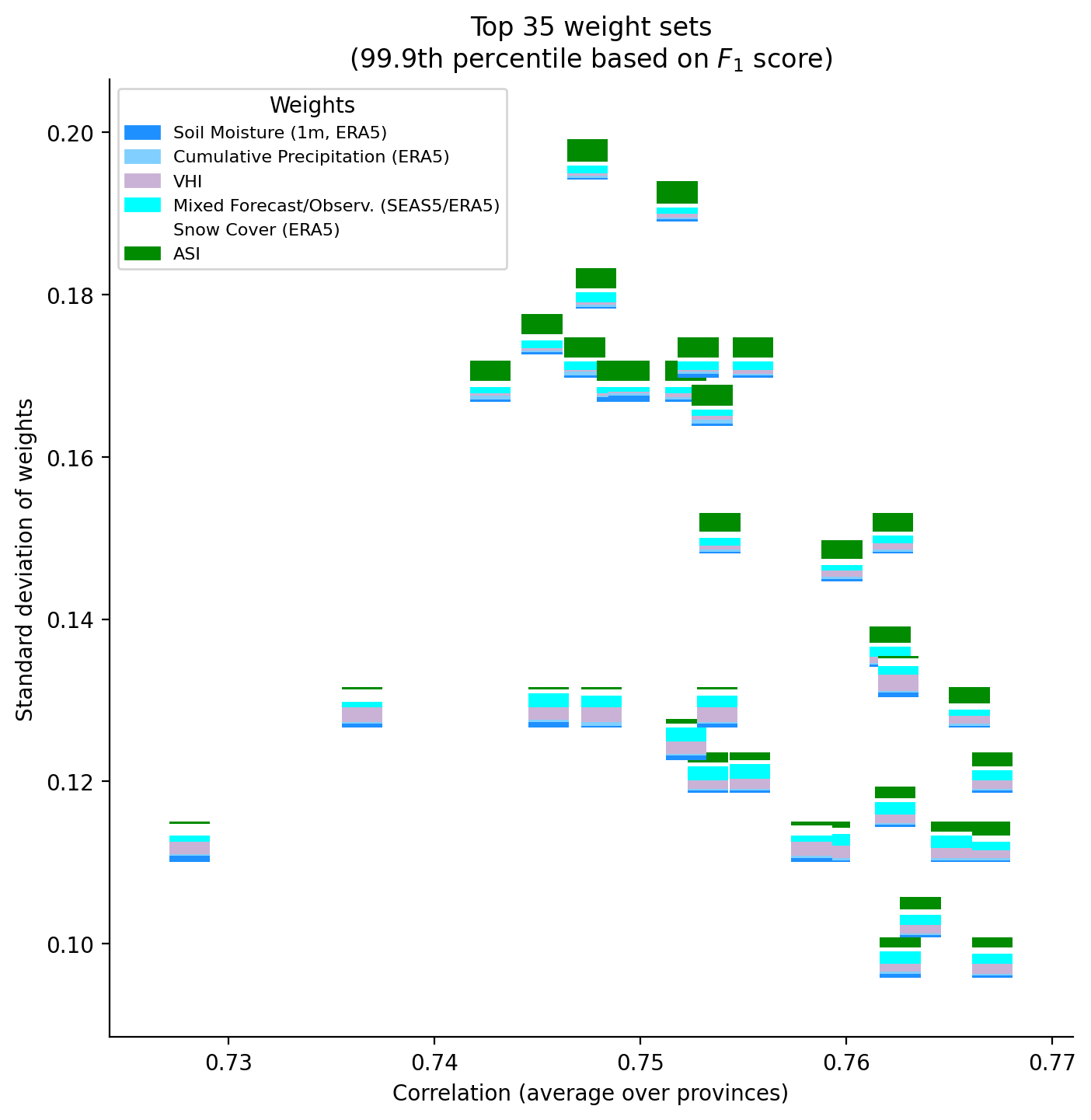
We add ID labels to the elite performing weight sets (top 0.1%) for clear identification:
q = 0.999
mean_f1_q = df_metrics_mean["f1"].quantile(q)
df_plot = df_metrics_mean[df_metrics_mean["f1"] >= mean_f1_q - 0.00001]

xvar = "corr"
yvar = "std"

fig, ax = plt.subplots(dpi=200, figsize=(8, 8))
df_plot.plot(x=xvar, y=yvar, linewidth=0, ax=ax, legend=False)

for wt_id, row in df_plot.set_index("wt_id").iterrows():
    ax.annotate(wt_id, (row[xvar], row[yvar]))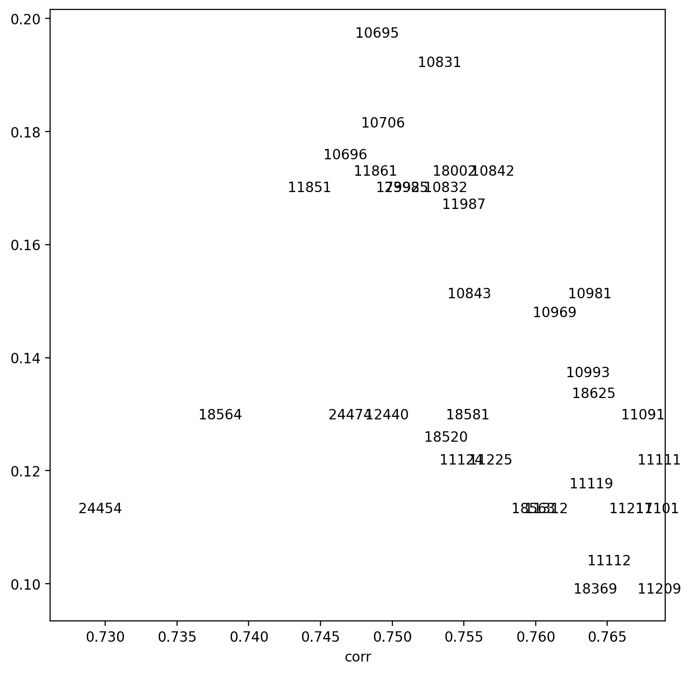
Here we visualize the composition of our selected weight set (11209) as a vertical stacked bar chart:
wt_id = 11209

# Retrieve the row
wt_row = df_wt_set.set_index("wt_id").loc[wt_id]

# Extract only the relevant weight values
values = wt_row[list(color_dict.keys())]
colors = [color_dict[key] for key in values.index]
labels = [label_dict[key] for key in values.index]

# Normalize for stacked bar
total = values.sum()
heights = values / total

# Compute bottom positions for stacking
bottoms = np.insert(np.cumsum(heights[:-1]), 0, 0)

# Create figure
fig, ax = plt.subplots(dpi=200, figsize=(3, 6))

# Plot stacked bar with labels inside
for height, bottom, color, label, value in zip(
    heights, bottoms, colors, labels, values
):
    ax.bar(
        x=0,
        height=height,
        bottom=bottom,
        color=color,
        edgecolor="black",
        linewidth=0.5,
    )

    # Label inside the bar (simplified names)
    ax.text(
        0,
        bottom + height / 2,
        f"{label}\n{value*100:.0f}%",
        ha="center",
        va="center",
        fontsize=6,
        color="black",
        weight="bold",
    )

ax.set_xlim(-0.5, 0.5)  # Keep the bar centered

ax.axis("off")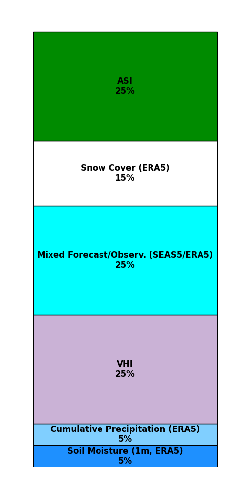
We extract the time series data for our selected weight set to examine its performance over time:
df_timeseries = df_weights_apr_nonzero.set_index("wt_id").loc[wt_id]df_timeseries["year"] = pd.to_datetime(df_timeseries["yr_season"]).dt.yearThis code saves our selected weight set’s time series data to be used in the production monitoring system:
blob_name = f"ds-aa-afg-drought/trigger_timeseries/cdi_wt_id_{wt_id}.parquet"

stratus.upload_parquet_to_blob(df_timeseries.reset_index(), blob_name)Finally, we visualize how the selected weight set performs for each province, showing the relationship between the combined indicator in April and the actual ASI values in June:
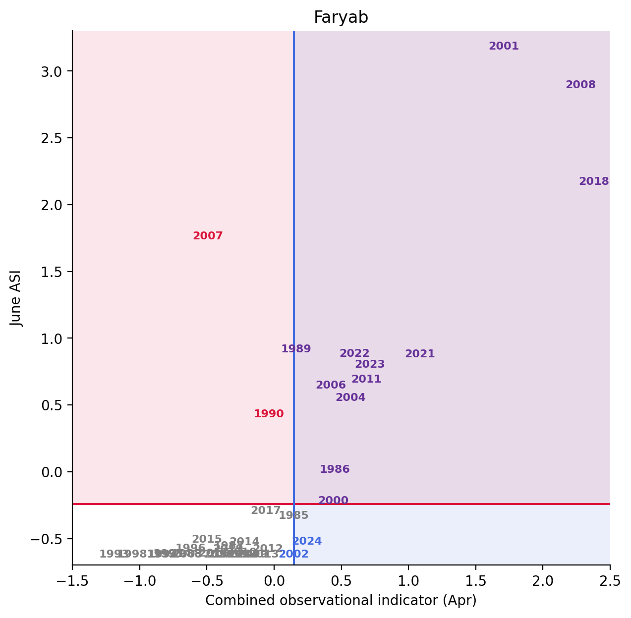
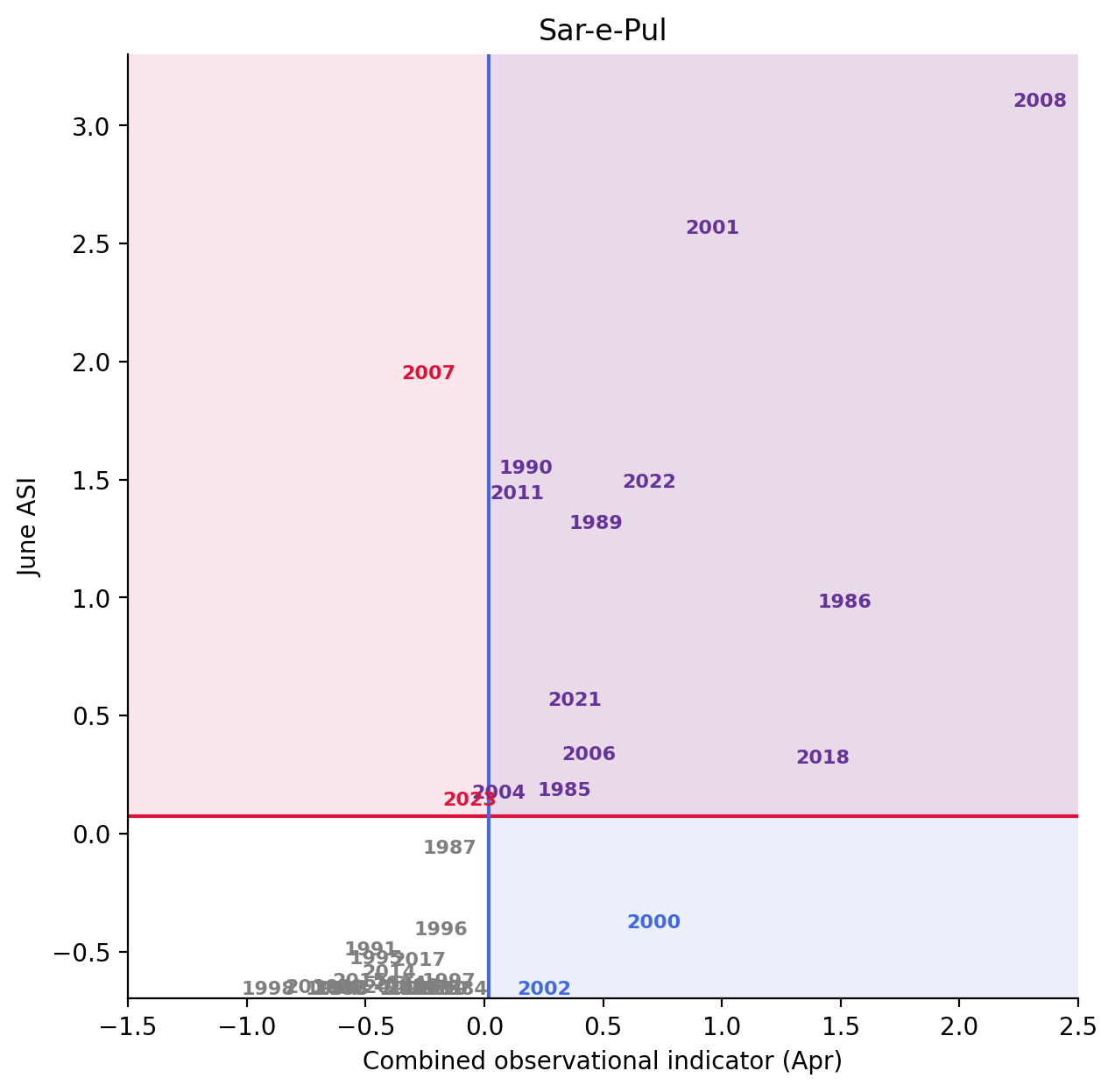
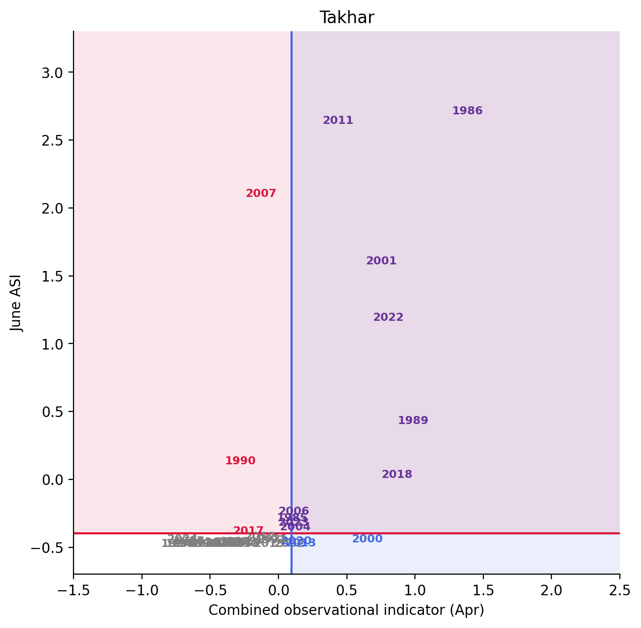
actual_color = "crimson"
pred_color = "royalblue"
both_color = "rebeccapurple"
none_color = "grey"

xmin, xmax = -1.5, 2.5
ymin, ymax = -0.7, 3.3

for adm1_name, group in df_timeseries.groupby("adm1_name"):
    fig, ax = plt.subplots(dpi=200, figsize=(7, 7))

    actual_thresh = group["zscore_asi_Jun"].quantile(2 / 3)
    pred_thresh = group["zscore"].quantile(2 / 3)

    ax.axhline(actual_thresh, color=actual_color)
    ax.axhspan(
        ymin=actual_thresh, ymax=ymax, facecolor=actual_color, alpha=0.1
    )

    ax.axvline(pred_thresh, color=pred_color)
    ax.axvspan(xmin=pred_thresh, xmax=xmax, facecolor=pred_color, alpha=0.1)

    for year, row in group.set_index("year").iterrows():
        if row["zscore_asi_Jun_flag"] and row["zscore_flag"]:
            color = both_color
        elif row["zscore_asi_Jun_flag"]:
            color = actual_color
        elif row["zscore_flag"]:
            color = pred_color
        else:
            color = none_color
        ax.annotate(
            year,
            (row["zscore"], row["zscore_asi_Jun"]),
            color=color,
            fontsize=8,
            fontweight="bold",
            ha="center",
            va="center",
        )

    ax.set_title(adm1_name)
    ax.set_xlabel("Combined observational indicator (Apr)")
    ax.set_ylabel("June ASI")

    ax.set_xlim(xmin, xmax)
    ax.set_ylim(ymin, ymax)

    ax.spines["top"].set_visible(False)
    ax.spines["right"].set_visible(False)